How's it going lovely people?
One of the crafts I am thoroughly into is lettering. I still love writing notes, lists and greeting cards. But over time, I find that my penmanship is lacking legibility, even I can't read my own handwriting!
Lettering allows me to pay attention to each letter, the spacing, the sizing and the flourishes. That's why I try to learn new techniques that range from calligraphy, hand lettering, brush lettering, using stencils and more calligraphy.
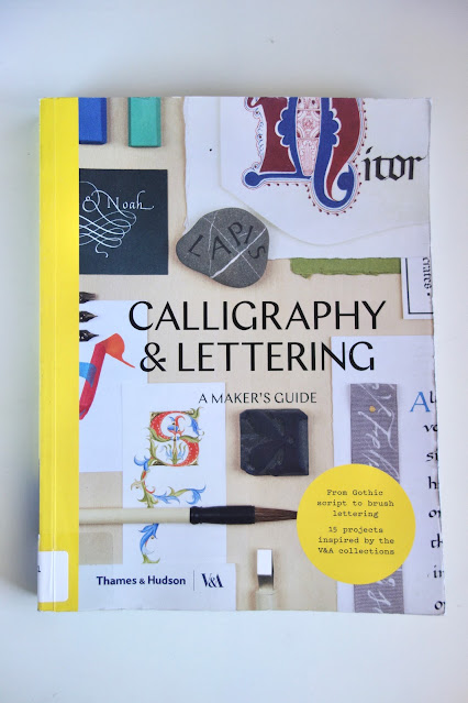
I found this book, "Calligraphy and Lettering: A Maker's Guide," at the library. It gives an insight to the various forms of calligraphy, a short history of each and how they were used at that time. For example, Gothic Script, which was popular in Western Europe during the 12th to 16th centuries, was used mainly for prayer books.
A particular kind of lettering that I've been curious about are the capitals and initials. You've seen these before in children's books or fancy novels where the first letter of the first word is a sophisticated capital letter, sometimes with elaborate designs surrounding it. I feel it turns a simple page from blah to TADA!
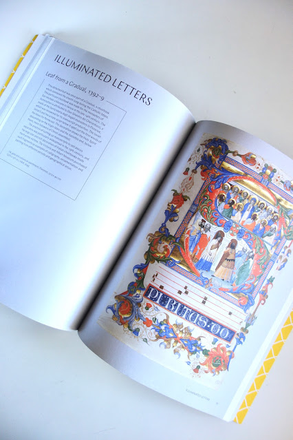
And as if that wasn't enough, how about illuminated letters -- the practice of decorating text or images with gold or silver. I guess that was their version of "bring on the bling."
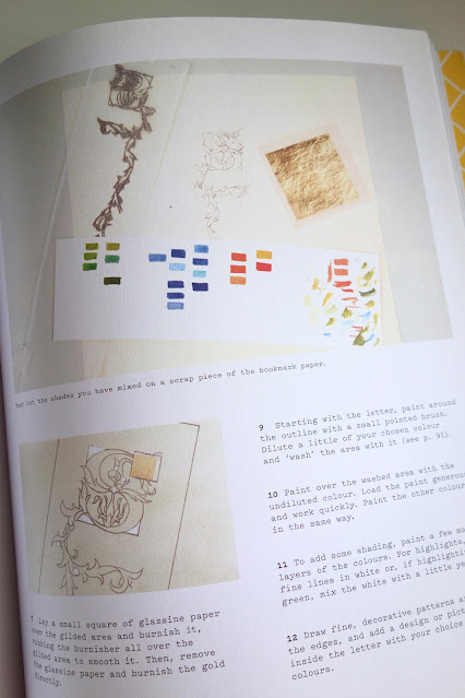
What I like about the book is that it has easy projects where one can apply these lettering techniques. I'm trying out the illuminated bookmark.
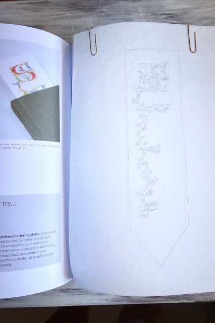
Good thing the book provided a template. So here's what I did:
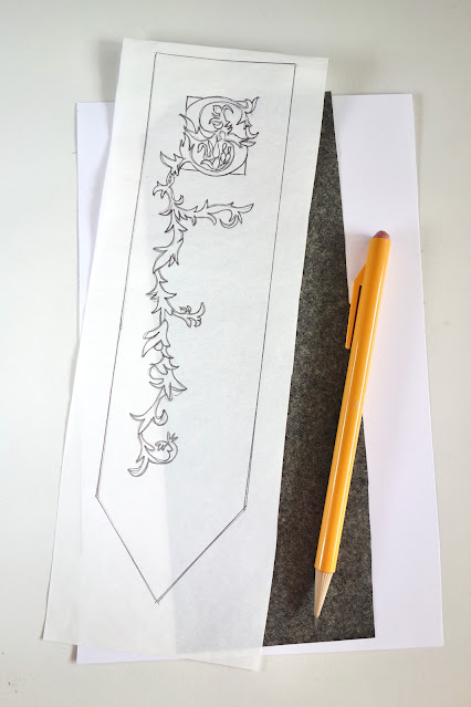
(1) Trace the template using tracing paper and a pencil.
(2) Transfer the image onto cardstock. I sandwiched a sheet of carbon paper/graphite paper in between the image sheet and a piece of cardstock. I used a paperclip at the top to hold everything in place, then I traced the image with a pencil. I checked if all the details transferred clearly on the cardstock before dismantling the layers of paper.
If you don't have carbon paper/graphite paper, here's another technique: turn over the tracing paper and, with a pencil, go over the lines using dark, heavy strokes. Flip the tracing paper and lay it on card stock or watercolor paper and tape it in place. Trace the design with a pencil (the pencil marks at the back should transfer onto the cardstock). Remove the tape and the template and go over the lines that you might have missed.
In case there are unwanted pencil marks, remove them with an eraser. Then trim the cardstock into a bookmark shape with a pair of scissors.
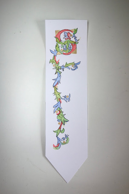
I used watercolor to fill in the spaces, referring frequently to the book for the correct shades.
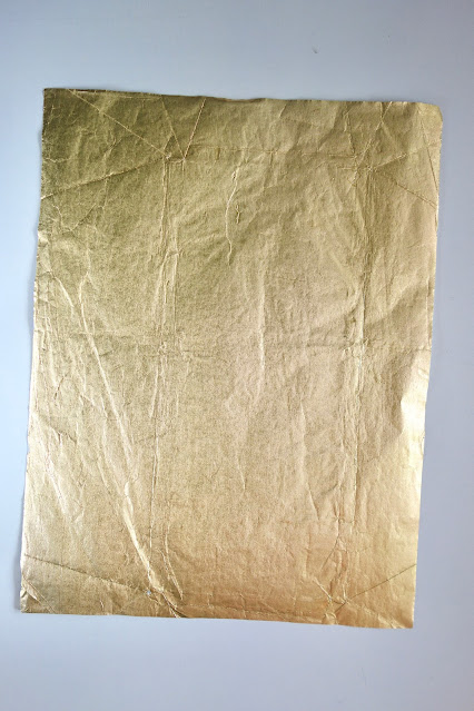
The corners of the letter S are gilded in gold. Traditionally, gold leaf or silver leaf is used. But since I didn't have that on hand, I'm using gold foil from a chocolate wrapper (I cleaned it with a damp towel to remove any chocolate stains and let it dry before using).
I cut the gold foil into small triangles and attached these to the cardstock with glue. I even made small circles (with a hole punch) to add more faux gold leaf around the vines.
Define the edges with a fine point marker. Let this dry for a few minutes.
Here is my first attempt at illuminated letters. It's also how I turned plain cardstock and gold-foil chocolate wrapper from blah to TADA!
I'll leave you with this quote from the book. As they say, "Start where you are, use what you have and do what you can."






Your bookmark is beautiful! The quote you left fits you to a T, Claire! "Use what you have and do what you can."
ReplyDeleteMany, many thanks, Priscilla!
ReplyDelete